
Independent Cartographic Storytelling
@the.cartographist is an independent cartographic storytelling project exploring geographic, political, environmental and social topics through maps. Published primarily on Instagram, it combines data-driven thematic mapping with research-based visual stories, country profiles and interactive formats.
The project aims to reach a contemporary audience whose experience of maps is increasingly screen-based, while preserving some of the richness and exploratory quality traditionally associated with printed cartography.
While the project’s roots date back to 2020, concept, workflows and content types have been reevaluated, sharpened and reorganised since winter 2025/2026. Classic and new features are described below.
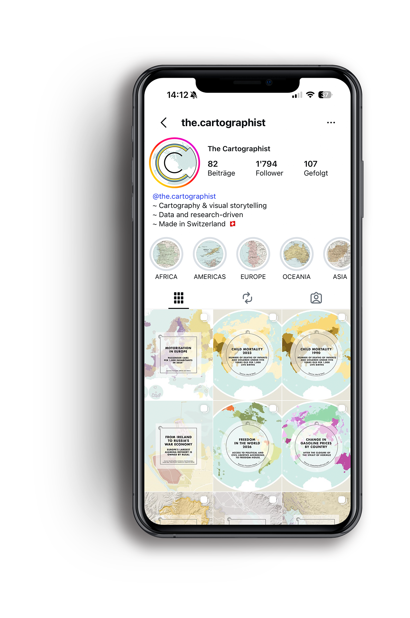
Types of Content per Instagram Feature
-
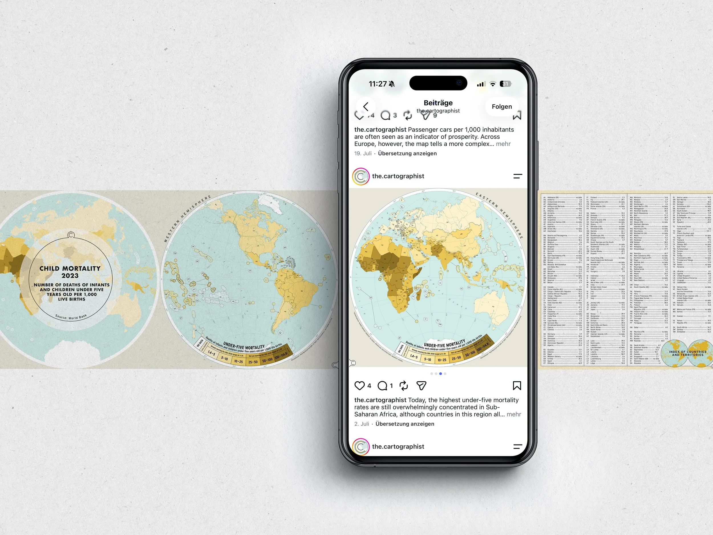
Posts - Data-driven Topics
Data-driven posts translate quantitative information into thematic maps, resulting often in a simple choropleth map. Instagram’s format constraints have nevertheless encouraged a constant refinement of the visual approach. These constraints are also the reason for visualising global topics as hemisphere carousels.
-
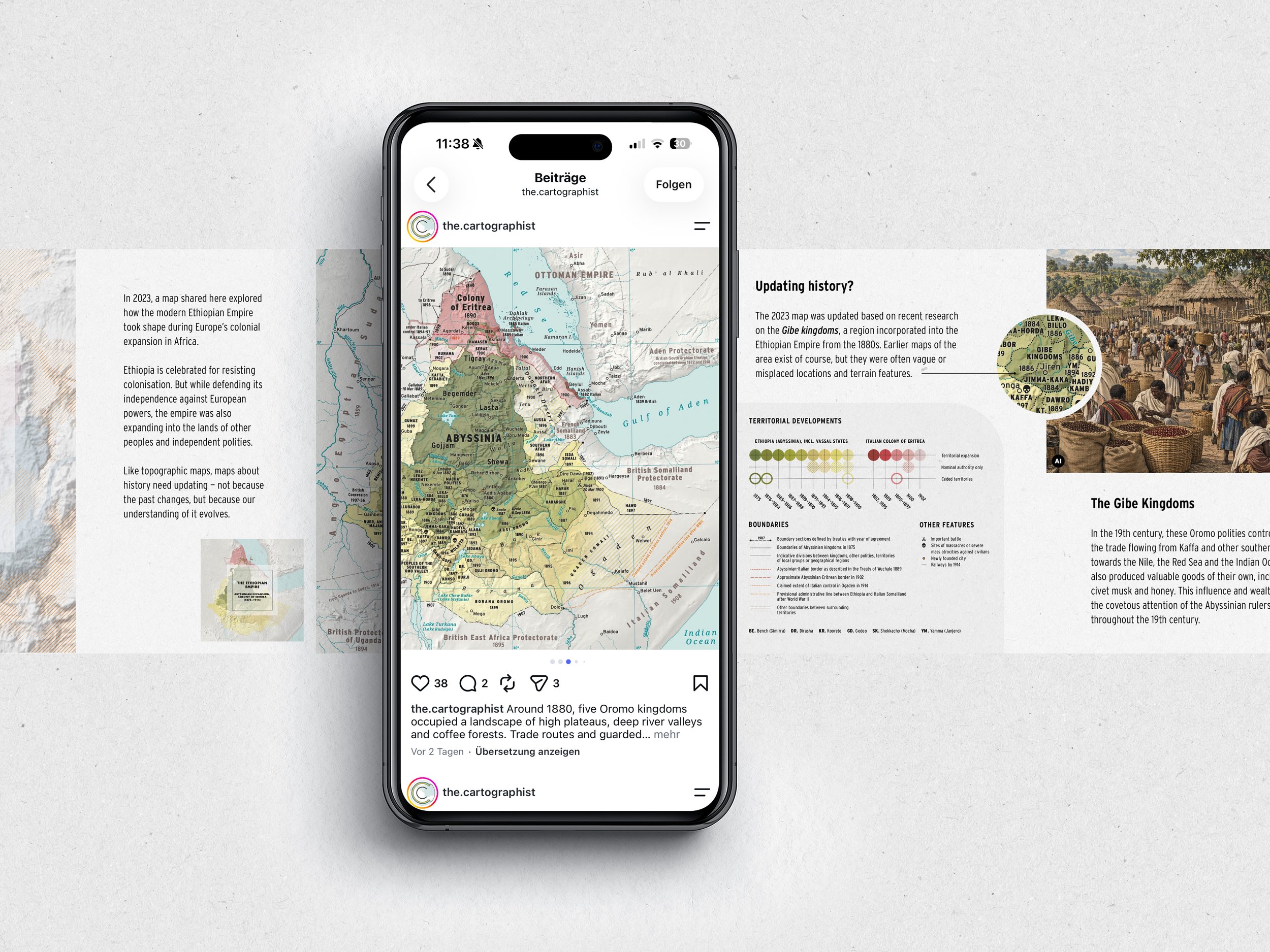
Posts - Research-driven Topics
Research-driven posts begin with a specific topic or question and its geographic relationships rather than a single dataset. The map visualisations are often a synthesis based on the analysis and interpretation of information from multiple sources. Different scales and viewpoints help explain a place, process or event in a more narrative way.
-
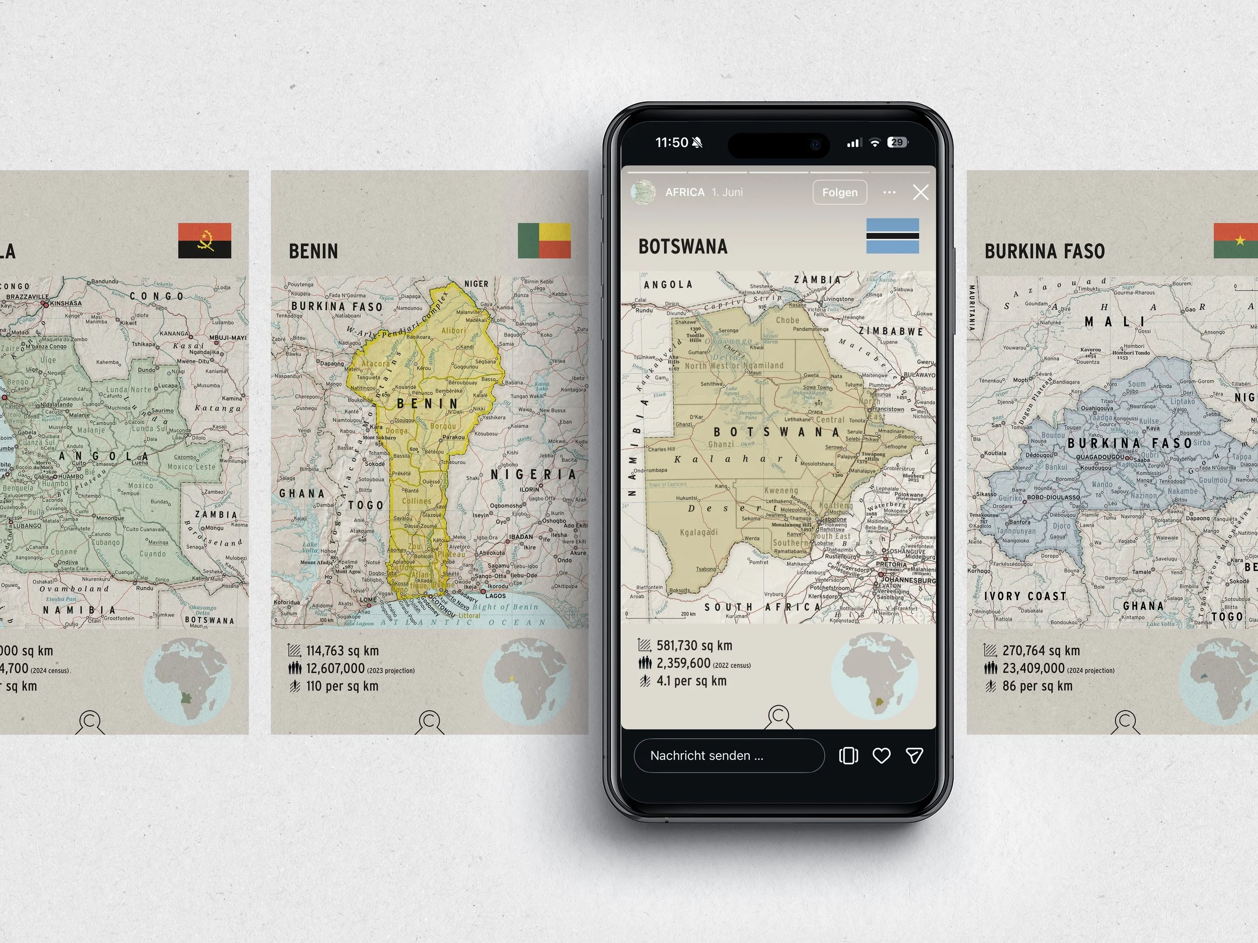
Highlights - Country Profiles
Introduced in winter 2025/26: Highlights have been turned into a growing country reference. Each continent forms one Highlight, gradually filled with concise country profiles combining a map, population and area figures, and the national flag. The process is ongoing.
-
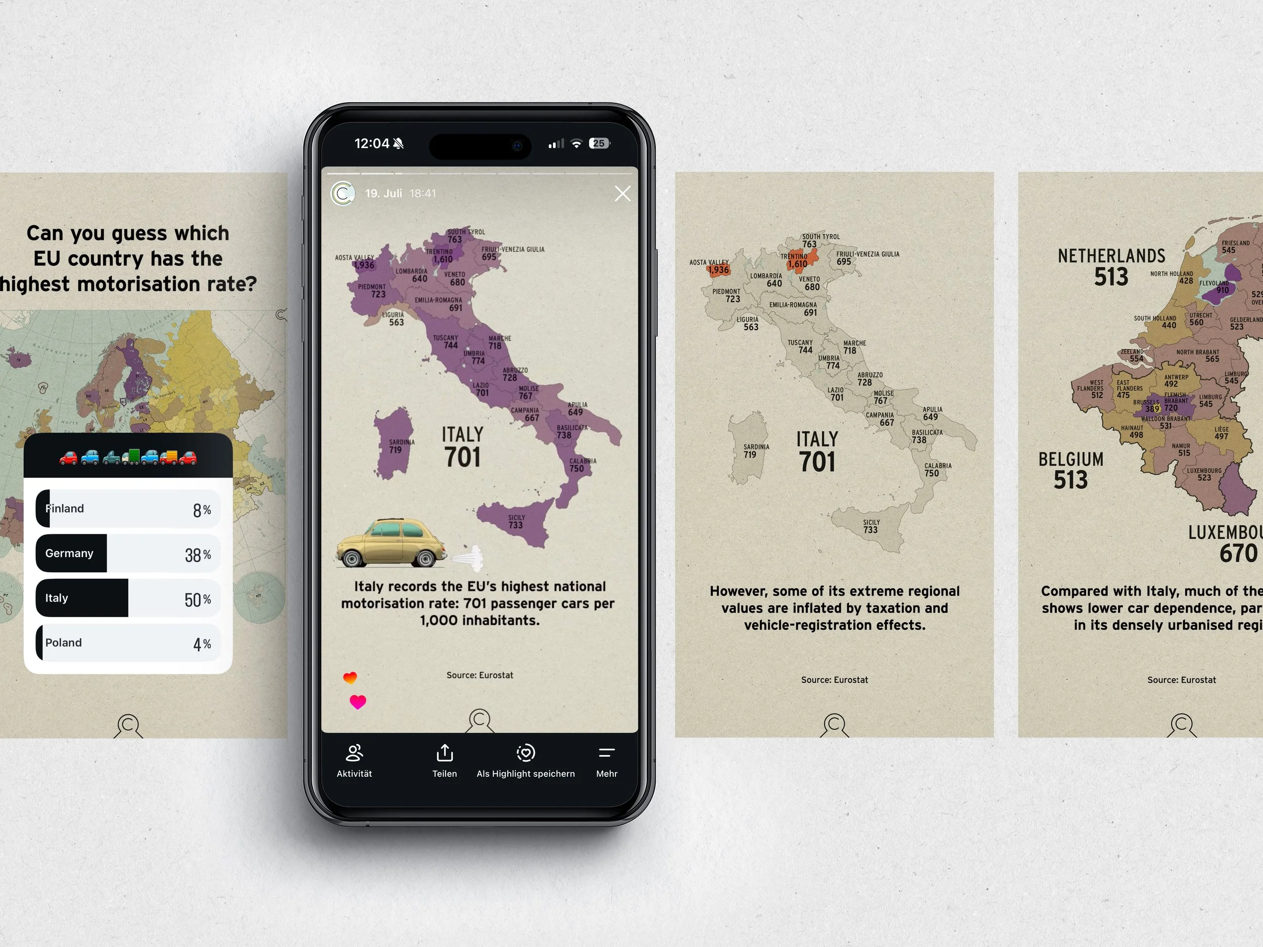
Stories - Classic Format
Stories provide a lighter and more interactive entry point into topics covered in regular posts. Quizzes, polls and short sequences are used to introduce a subject, test assumptions or highlight individual aspects before readers encounter the more detailed cartographic content.
-
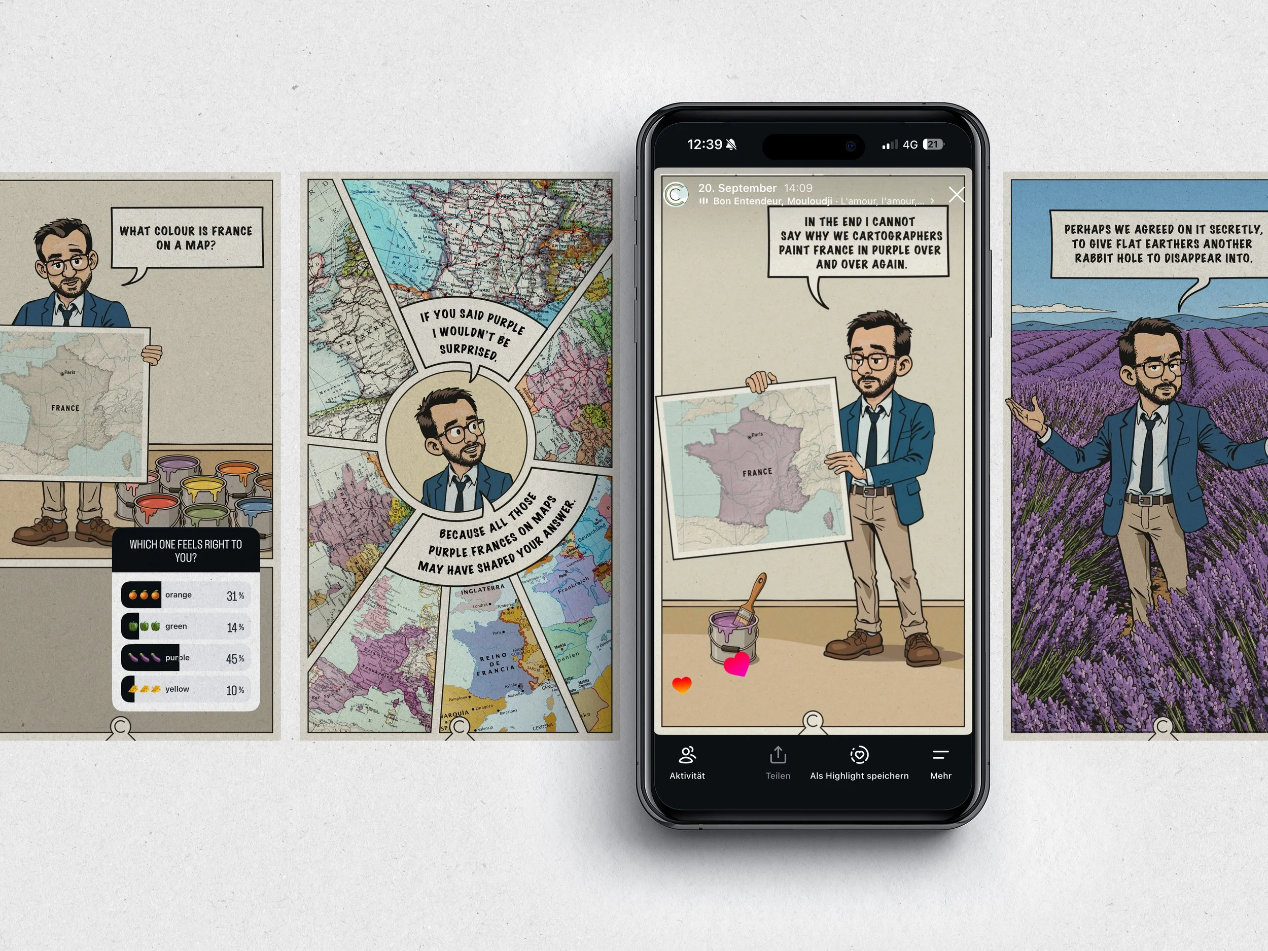
Stories - Geographic Trivia
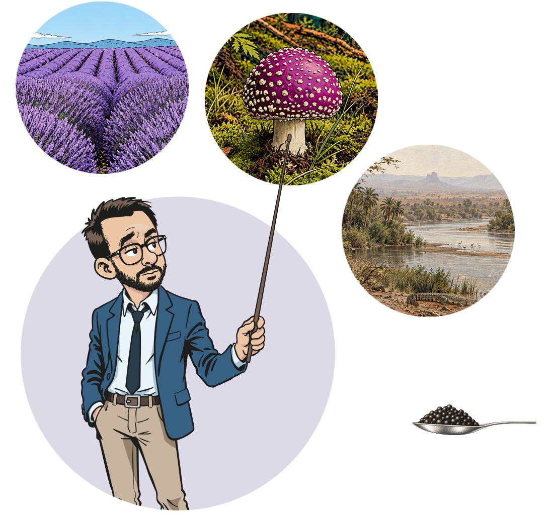
Introduced in summer 2026: Gregor is a sardonic fictional character with a dark sense of humour, created to explore lighter, more playful geographic and cartographic topics in comic form. Along the way, he occasionally asks deliberately uncomfortable questions to test the knowledge of the users.
-
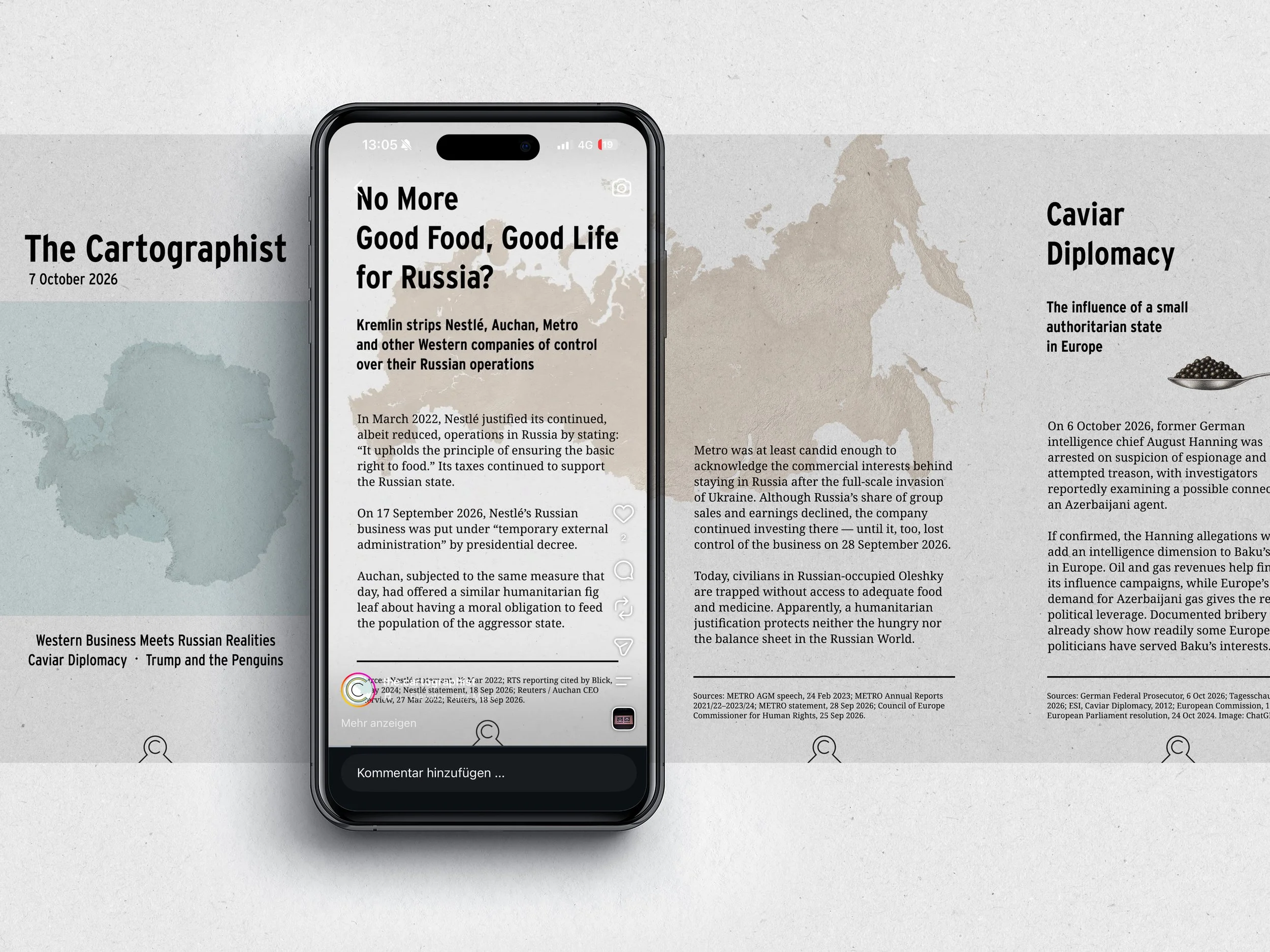
Reels - Editorial Archive
Introduced in autumn 2026: To preserve Story content that grew out of current events, as well as lighter or more playful topics with a lifespan beyond 24 hours, I have recently started adapting selected Stories into short video formats and publishing them as Reels.
Design & Production
-
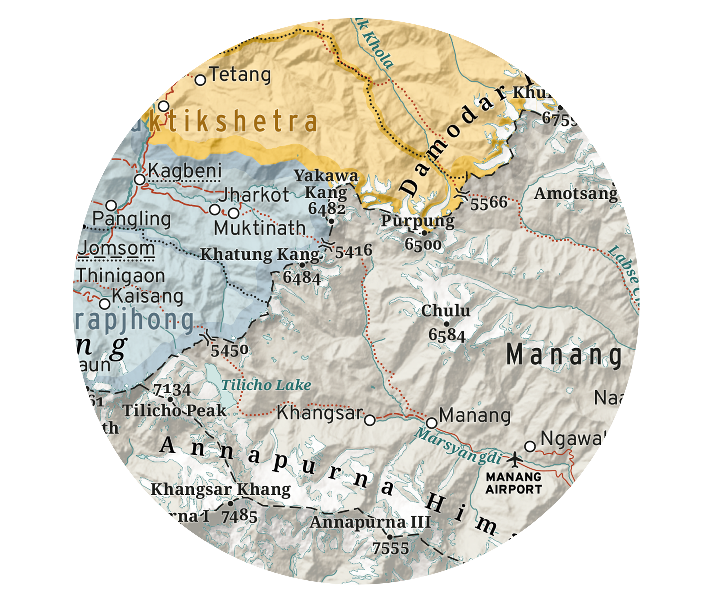
Cartographic Aesthetics
Less is more, but not always enough. The visual language of @the.cartographist aims for clarity without reducing maps to the bare minimum. A map still has to attract attention before it can reward it.
Colour palettes are therefore designed to be harmonious but functional, while devices such as tonal bands, relief shading and carefully balanced graphic detail add visual richness without overwhelming the information. The resulting style often draws on analogue mid-century cartographic design, translated into a contemporary visual language for small screens.
-
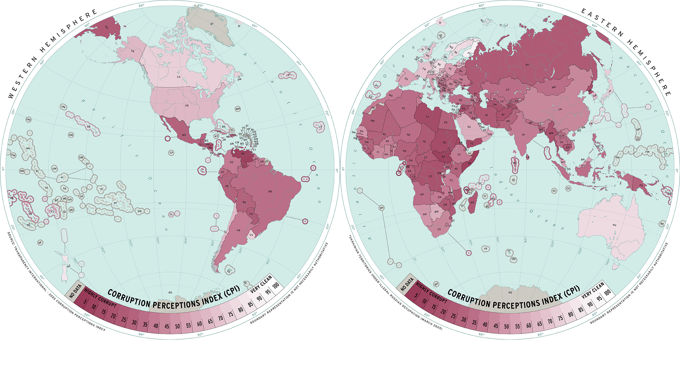
Projection as a Design Decision
The double-hemisphere world map emerged from the challenge of fitting a horizontal world map onto a vertical screen. Splitting the world into two views improves the legibility of small features, avoids awkward cropping, gives the Pacific greater prominence and moves Europe away from its habitual central position.
While not free from area distortion, the hemispheres also remind viewers that the Earth is a globe rather than the rectangular world familiar from modern map services using the Web Mercator projection. Recent reactions to the UN’s recommendation to favour Equal Earth showed just how strongly digital mapping has shaped that mental image – at times as if Mercator were the only way to depict the world.
Beyond the debate over supposedly ‘fair’ world maps, the paired hemispheres have become one of the most distinctive visual signatures on @the.cartographist.
-
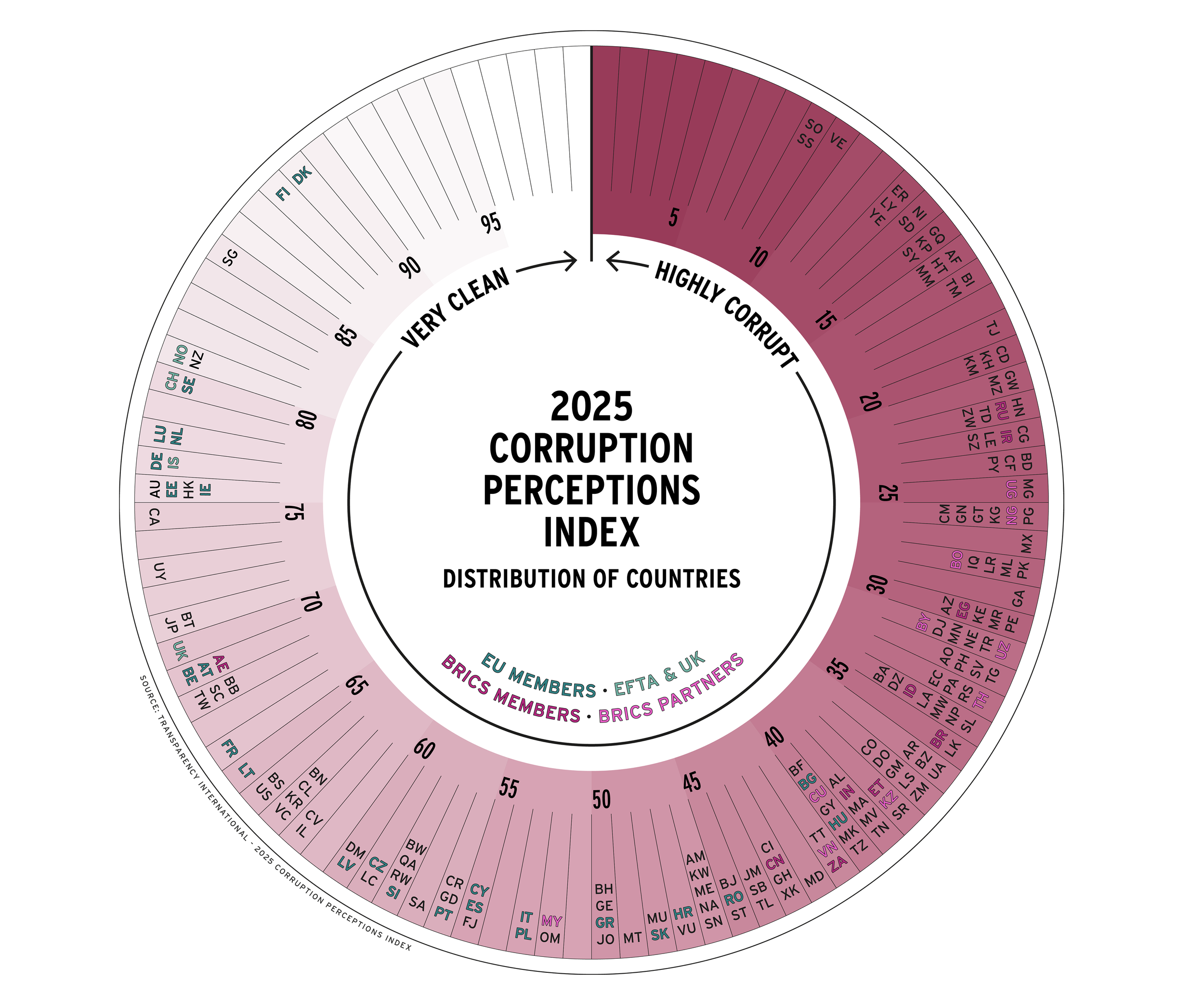
When Maps Are Not Enough
Maps remain the central medium of @the.cartographist, but some topics benefit from complementary charts and diagrams. These are used selectively to show change over time, compare quantities or add context that would be difficult to communicate spatially. They follow the same visual language as the maps and are intended to support – rather than compete with – the geographic story.
Global topics are generally accompanied by a country list, which identifies the ISO country codes used on the map and provides space for exact data values that would otherwise add unnecessary visual density to the map itself.
-
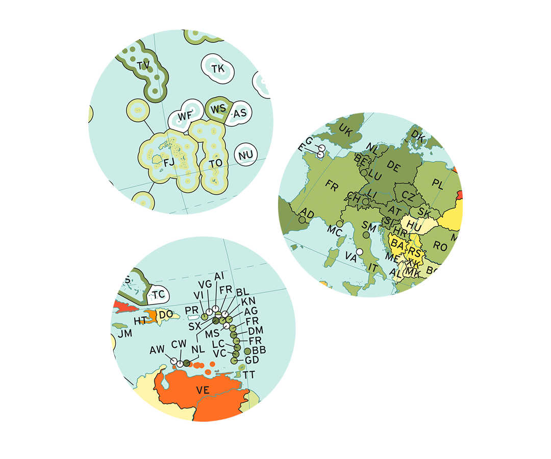
Designing for Geographic Visibility
The techniques used to keep small states and widely dispersed island nations visible – without giving them disproportionate visual weight – have gradually been refined into a coherent visual system. Rather than relying on a single solution, the maps combine devices such as insets, halos, bands, outlines and connecting lines, while maintaining a crisp and consistent graphic style.
-
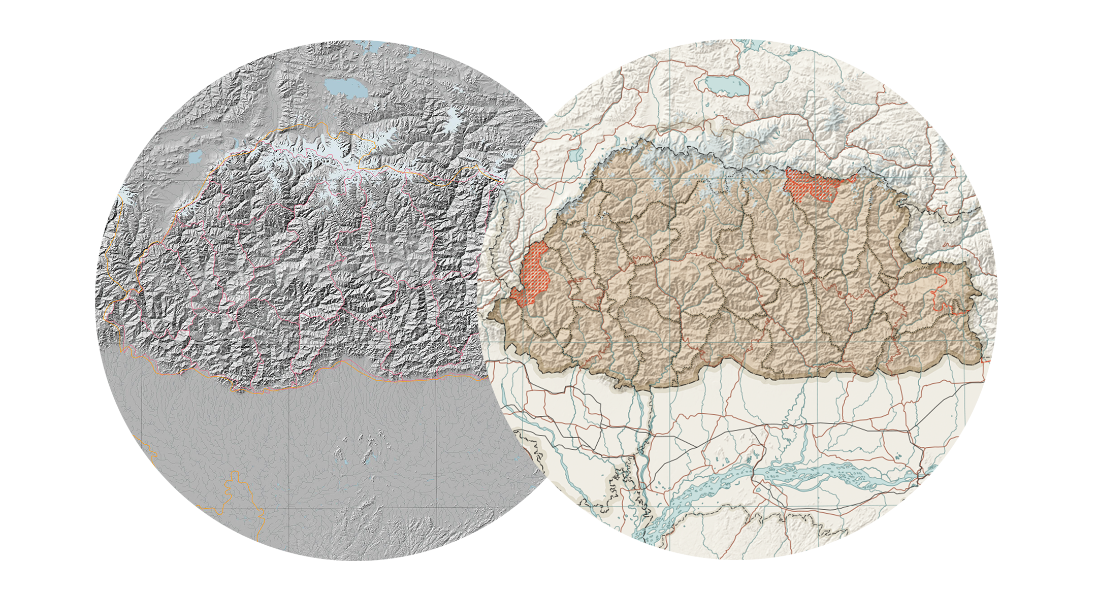
A Hybrid Workflow
Base maps are usually prepared in QGIS, where projection, geometry and geographic accuracy can be handled systematically and efficiently.
The transition into Illustrator and Photoshop nevertheless happens deliberately early. This keeps generalisation, visual hierarchy, typography, colour and editorial judgement closely connected to the geographic material rather than treating them as a final layer of decoration.
-
Human Judgement and Automation
Automation is used where it reduces repetitive work, but the maps themselves remain deliberately human-led. AI helps structure projects, organise research and develop narratives, but it is not used to generate the cartography itself. Decisions about classification, generalisation, emphasis and interpretation remain part of the manual design process.
Generative AI is used selectively for illustrations and supporting visual elements. These are not treated as finished outputs, but combined with self-produced material and further edited as part of the overall composition.

About Me
My name is Mario Stöger, born in 1983, and I have been based in Geneva for the past 13 years. During that time, I worked at the headquarters of Kempinski Hotels, first as an in-house designer and ultimately as a global art director, steering the visual identity of the brand and its various concepts.
I originally studied Cartography and Geomedia Technology at Munich University of Applied Sciences. Maps have been part of my life much longer than that: I started drawing them at a kitchen table in the Bavarian countryside when I was six.
The idea for @the.cartographist emerged during the Covid period, when months of reduced working hours gave me the opportunity to return more intensively to cartography. Since leaving Kempinski at the end of 2025, I have been refining the project’s concept and developing a more efficient workflow that combines GIS, graphic design and selected uses of AI.